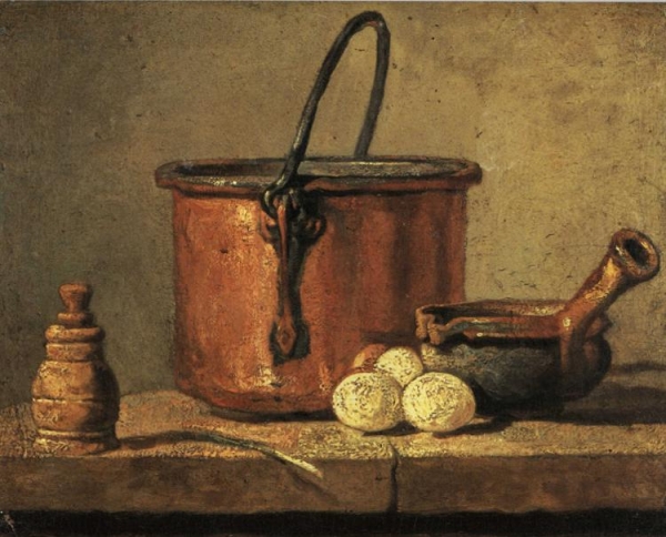
Another part of studio assignment was a still life. Having searched through many examples in books and on internet I decided to use this one by Jean Chardin (c.1732). I like it’s colours and overall feel, which I will try to convey in my photograph. Due to simplicity it was also easier to concentrate on the lighting in the scene, direction and shape of the shadows, textures and tonality.
When we talk about light we can say that a particular light source has qualities such as brightness, colour and contrast (meaning hard or soft light). But that is not everything. Lighting in photography is more than just a light – it is the relationship between the light source, subject and a viewer. Some subjects would reflect the light more than the others, some would absorb and some transmit light (pass through, like glass for example).
Material can reflect light in many different ways. One type is diffused reflection – light is reflected equally in all directions, it has the same brightness regardless of the angle from which we view it. Matt surface could give diffuse reflection. Another type is direct reflection – a mirror image of the light source in the subject – also called specular highlight. Brightly polished metal, water or glass surface can easily produce it, depending on an angle. Therefore managing relative size and position of the lights in the setup is crucial. Also light needs to sculpt the subject and produce highlights and shadows to convey dimensionality.
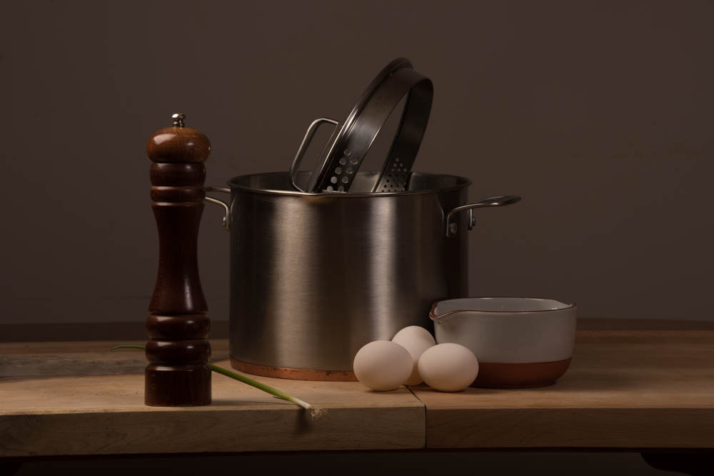
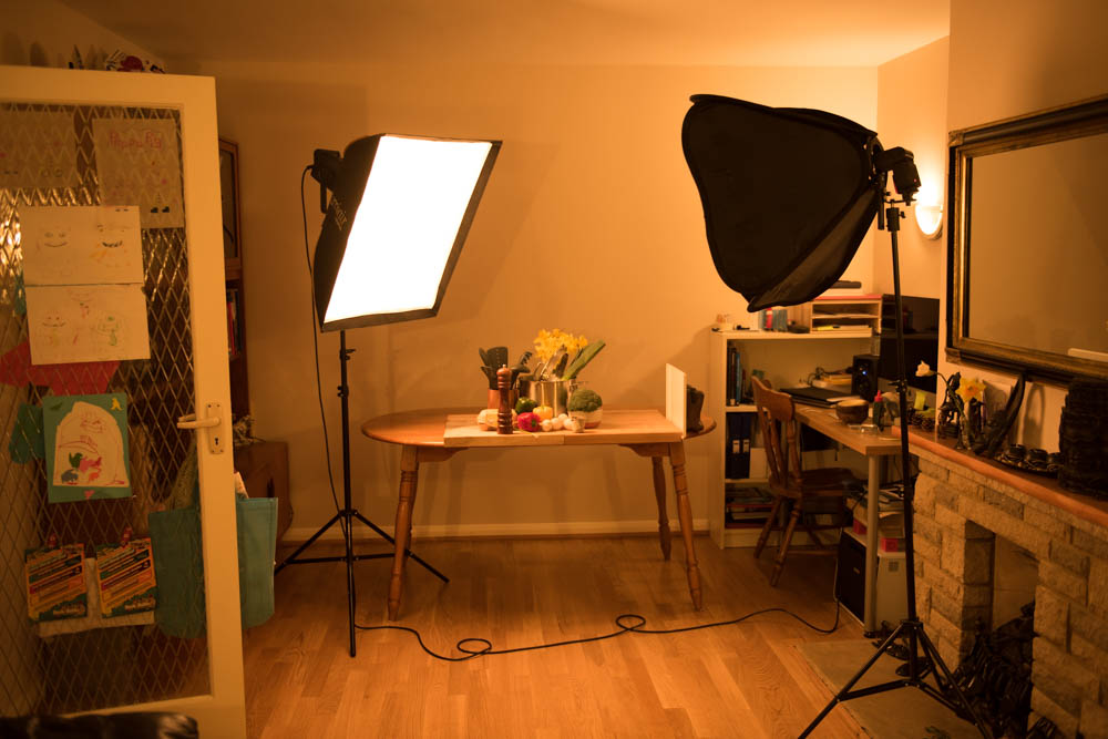
To start with I decided to recreate the painting to achieve all the information in highlights and shadows. My key light was Bowens Gemini 400Rx studio strobe with 60x80cm softbox, placed about 50cm–1m to the left and the same distance up from the composition. I experimented with moving it from front to back, keeping the same distance. I found to my surprise the best result to be about 45 degree to the left and back of the composition. It gave the nice wide, diffused highlight to the side of the pot, and still quite a lot of light on the rest of the items and work surface.
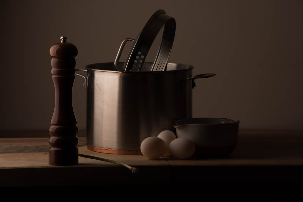
Now second source of light was needed to illuminate the front edge of the table. My first choice would be to try large reflector, but didn’t have a suitable stand with arm to hold it properly and safely in place. Health and safety first. Due to time and space constraints I decided to use my Yongnuo YN568EX Speedlite in a smallish 60x60cm softbox as a second light. Flash was set to manual mode and triggered via build in optical slave by the main strobe light. Again I had to experiment with positioning and power of the second light source until the desired effect was achieved. I found the best place for it to be to the camera right, further away and pointing down. It helped to fill in the shadows in darker part of the composition, illuminate the front edge and produce a shadow under the spring onion hanging over the edge. Additionally it created nice second highlight on the pot, making it look more three-dimensional.
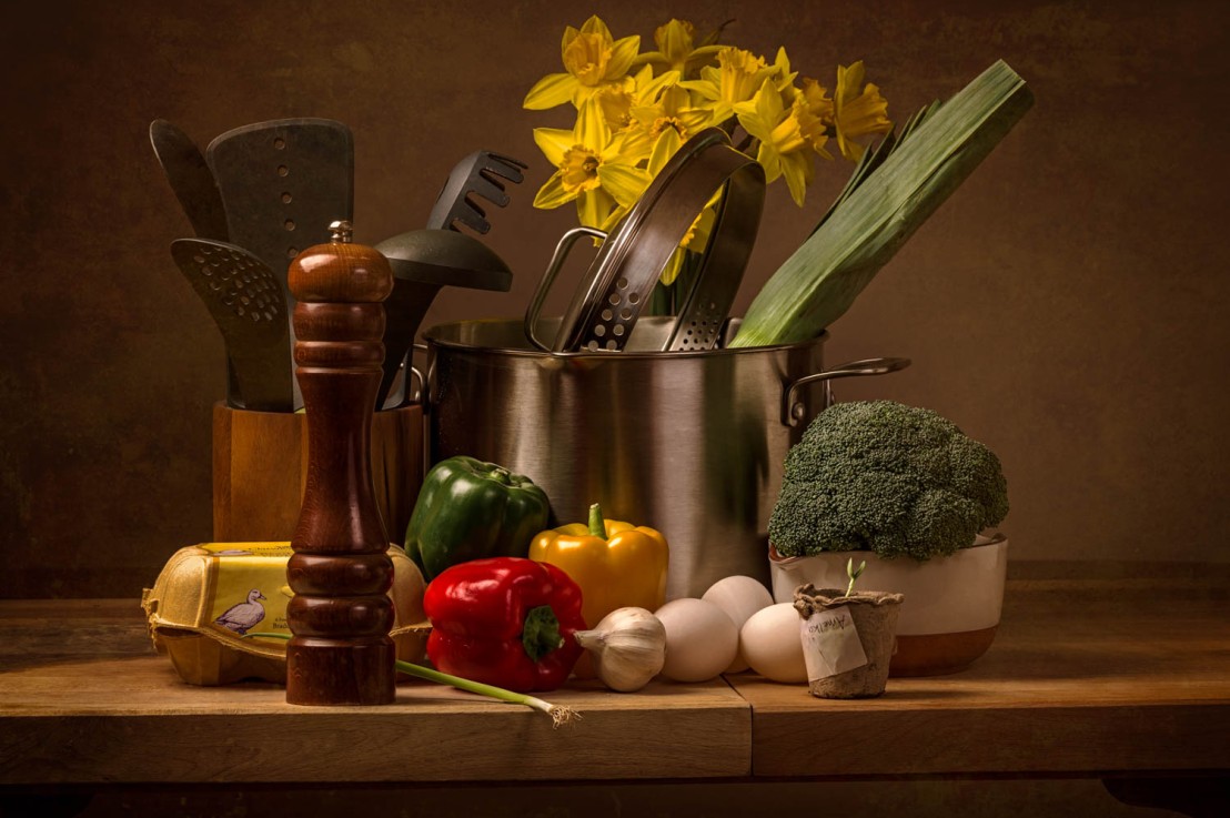
Having achieved a good approximation of the painting it was time to add more props and make it into my own interpretation. Since Easter was approaching and there were eggs in the composition already, I decided to add more elements symbolising this occasion. Bright yellows, reds and greens added some vibrancy to the composition and went well with the brown, muted colours of the rest of the props. I kept shooting, changing some details each time and holding reflector under the second light for some extra fill-in and diffusion of specular highlights.
The final setup looked a little bit like this:
Finally 217 photographs were imported into Lightroom. To choose the best ones I tend to use star rating system. Going through them after import, all images that are potentially good receive 1 star, and the rest doesn’t get any rating. Using the filter, only images with 1 star go to the next round, where I’m looking for better composition, better lighting and assign 2 stars. Narrowing the selection further, now between 2-star rated images, I’m looking for the ones that stand out, taking into account parts of the shot where composition or lighting changed. They will get 3 stars, and be candidates to post processing (no processing yet at this stage).
From 3 stars images I selected 4 “heroes” that were the best in my opinion. Each showed the composition in successive stages of completion, and they went to post processing stage.
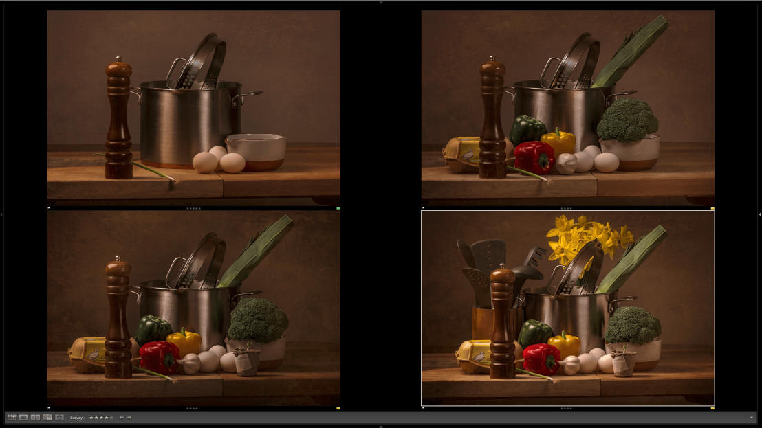
Because the light conditions didn’t vary too much between shots, it was possible to do basic adjustments on one picture first and than copy it to the rest.
Post Processing:
First in Camera Calibration panel changed camera profile from Adobe Standard to Flat, to reduce contrast. Than in Lens Corrections panel selected Remove Chromatic Aberrations and Enable Profile Corrections to straighten the lines distorted by optics of the lens. Since the painting is in brown hues, I warmed up a picture, sliding WB slider to the right a little until I was pleased with the effect. Then basic tonal adjustments:
- Exposure +0.50
- Highlights -55
- Shadows +33
- Whites +56 to compensate for loss of brightness caused by lowering of highlights
- Blacks -19 stop just before clipping
- Than added a little bit of contrast +8
- Clarity +40
- Vibrance +16 for a good measure
There were two potential problems: blown out specular highlights on top of the pepper mill, and in the middle of the pan cover. There were no blocked up blacks. I didn’t want to add any more contrast by manipulating tone curve, as I planned to do it later by applying film presets in Alien Skin Exposure X. They come with their own contrast curves that mimic the look of the classic film stocks.
Than a little bit of colour adjustments with a target tool in HSL (Hue, Saturation, Luminance) panel:
- Lowered saturation of orange -54; yellow -2
- Lowered luminance of orange -11; yellow -4
And a little bit od sharpening in Detail panel (Raw images are unsharp by nature):
- sharpening +50 (default setting is +25)
- Noise reduction> luminance +30
That was about all post processing that I wanted to do in Lightroom. I thought all the little imperfections looked natural and added to the organic feel, so decided to skip retouching process in Photoshop altogether. It was time to export to Alien Skin for finishing touches. I quickly settled on Kodachrome 25 preset (from “Color Films – Slide” section), for its sharpness, contrast and colour punch. Last thing to do was to add a texture to make it look more painting-like. It took some time and a lot f tweaking to achieve the desired effect, but in the end I was very happy with the result.
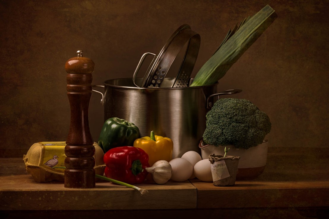
Originally I planned to print all my selects them at dscolourlabs.co.uk on Hahnemuhle fine art paper German Etching of Photo Rag. Unfortunately there was not enough time to receive the prints back by post. So I went to the local high street printing shop where they use only laser printers for business purposes. They were kind enough to let me experiment with different texture and thickness of papers and the prints turned out to be surprisingly good. Out of two this was the one that was ultimately chosen for submission and display.
Assignment criteria: 1,2,3,4.
Reference:
Hunter, Fil, Steven Biver, and Paul Fuqua. Light: Science & Magic. 5th ed. New York and London: Focal Press, 2015. Print.
Alexandre Buisse. The Workflow Book. Craft and Vision, 2014. PDF

Unit 23 1 2 3 4
LikeLike